| Al's Photoshop Tutorial | New Course (Versions 7.0 and above) |
The next thing we're going to do is to put down the final linework. If you're good at traditional inking, it's also possible to ink your drawing physically and scan it in to color from that, but for our purposes, inking done on the computer will have much more manageable results. It's also good to at least try inking on the computer once, because it really helps you learn about the brush system and other inner workings of Photoshop. There are several ways that the inking can be done, and I'll cover a few of them, but before we begin, we should learn about the tools we'll be using.
Inking is rather a large topic, so I've broken this step down into a few pages. This page will cover the basics of the tools we'll be using from here on in, and next we'll be learning about PhotoShop's new Brush system, and after that we can finally start drawing.
Okay, you should see the tools palette on the screen. If you don't, it can be found in the menus (Window » Show Tools). These are the tools you use to edit the current layer. Also, you should know that any tool that has a little arrow in the lower right corner of its box has more than one mode. You can click and hold over it to see all its modes.
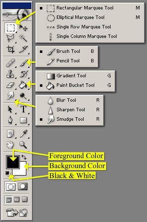
Here's a screenshot of the Photoshop 7.0 tools window. I've opened up some of the more useful tools to show all their varieties, and put labels on some other useful parts. It's a good idea to set the tools with multiple varieties to the ones I have selected here, since we'll be using the Brush, Paint Bucket and Smudge tools later.
The top batch of tools has to do with selection and basic editing. The Marquee tools can select areas in the shape of rectangles circles, and lines. Go ahead and use the Rectangular Marquee to select a small part of your image. Any selected area will be outlined with a black and white pattern some people like to call "Marching Ants." Any actions you do will be confined to that area. The selection can be cancelled with "Select » Deselect", or Ctrl+D on they keyboard. Other important tools in this batch are Move (allows you to drag around a selected area), Lasso (for drawing your own selected areas), and the Magic Wand (for selecting an area of alike colors).
The next batch is the freehand tools. The most important ones are the Brush tool, which draws with soft brushed defined in an interface I'll describe later, and the Pencil tool, for coloring solid pixels. The Eraser tool works like the brush tool, except that it turns things transparent instead of drawing. The Paint Bucket tool is good for filling areas with a color or pattern.
Next, we have some vector tools. Things like text and penstrokes can keep their data in memory as the lines they follow, instead of the pixels they occupy, which can make resizing them free from the lossy blur that happens when you resize a pixel-based image. Don't worry about these too much just yet.
Under these are some miscellaneous tools. The hand and the magnifying glass are very important, because they can be used to pan and zoom your view of the image you're working on. It's good to know the keyboard shortcuts for these: Ctrl+Plus and Ctrl+Minus zoom in and out, and clicking and dragging the mouse while the space bar is pressed will pan the picture. The eyedropper tool is also good to know, since you can use it to pick colors to work with from an existing picture.
The panel below that shows two overlapping colored squares. The one on top is the foreground color, which is the color that all the drawing tools use. The one in the rear is the background color, which is the color that the eraser uses on a layer that cannot be transparent. These colors can be changed by clicking on them (see below for more info on the color picker). The icon above and to the right of these squares exchanges the foreground and background colors. The one in the opposite corner restores them to Black on White.
Below that is another tool for selection and editing. These are Standard editing mode and Mask editing mode. You'll usually want to keep this in Standard editing mode, where the drawing tools affect the current layer. In Mask mode, the drawing tools draw on a red overlay, which becomes the selection when you change back to Standard mode.
Below this are the window modes. With these you can make the image you're working on appear in its own window, or fullscreen. I usually keep it in its own window.
Select the Brush tool. There's a bar near the top of the screen that will change and
look something like the bar here. This is the tools options window. Users of previous
versions of PhotoShop may remember that this stuff used to be in a side-tab, but in this
version, it plays a more important role, and is more prominently displayed. Although
every tool has its own set of options here, some are pretty common. On the very left
is a pulldown menu you can use to store presets of the current tool, which is very
useful for defining customized variations of a tool that you'll re-use a lot. The "Mode" is
another common one, and works a lot like the "mode" of a layer. It's best to keep this
on "Normal" while you're learning.
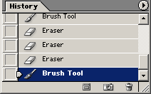
This window allows you to undo more than one action. The list
in the window shows the recent actions you've taken, the most recent on the bottom.
Clicking on previous steps undoes any actions done since that step. A good shortcut
to undo the very last action is Ctrl+Z, which is very useful when drawing.
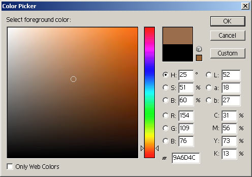
Above is the color picker mentioned before. When you click on the foreground or background color box, this comes up, and you can select a new color for the box you clicked. Colors can be specified by a number of different systems that use three channels. RGB color is here, and so is CMYK (you can't pick colors from CYMK since it has one too many channels, but the values are displayed). Also here are HSB (Hue/Saturation/Brightness) and LAB (Luminance/A/B). Whichever channel you pick goes into the vertical slider in the middle of the window, and the other two channels associated with it are put along the two dimensions of the square to its left. I usually like to have "H" selected, which puts hue along the bar, Saturation horizontally in the box, and Brightness vertically in the box.
HSV is fairly easy for an artistically minded person to understand. To find the color you want, think of its hue first, and select that, and then find the tone you want within the square. RGB color may be better for the technically inclined, since it deals with the raw values that the computer thinks in. LAB is how color is broadcast on television signals, and is pretty to look at, but isn't very useful for picking colors. Luminance is the brightness of a color, and with A and B set to 50%, would be a color's equivalent in black and white. A is a measure of how much Red deviates from the luminance, and B is a measure of how much blue deviates. The hexadecimal code just below the RGB values is very useful for web developers, since that can be dropped into HTML or a style sheet to specify the exact color you've picked.
| Back: Setting Up Layers | Home | Next: The Brushes Window |
| Skip Ahead: Getting Ready to Color |