Without Highlights: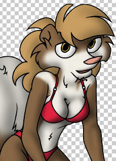 |
With Highlights: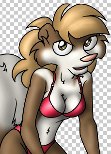 |
| Al's Photoshop Tutorial | New Course (Versions 7.0 and above) |
A good counterpoint to shading is highlights, where parts of the image are airbrushed lighter. You have to be kind of careful to keep it subtle, because highlight can make things look wet or rubbery if it's too bright or too sharp.
Start this layer off the same way as the shade layer, by making a copy of Color, but this time call it Highlight. Use the same old process to get rid of the black linework, but this time you'll want to fill the rest with black instead of white. Move this layer just above the Shade layer, but still under the Ink layer.
There are a few options available for which layer mode to use. The "Screen" mode works just like Multiply in reverse, so it's very controllable and predictable. The "Color Dodge" over-saturates the color before lightening it, which is unrealistic for plain surfaces, but is great for metallic surfaces. "Linear Dodge" acts the most like natural specularity, but is a little harder to control than "Screen". Try using those two, or all three, and see which one you're more comfortable with. Don't use "Lighten" mode, since it can really desaturate when it shouldn't. In my picture, I'm going to use "Linear Dodge".
Once you have the layer, the process is exactly the same for drawing highlights. Remember that the key to good highlights is to be very subtle on most surfaces. Try to keep in mind while highlighting which surfaces are shiner than others. You can also, as I've done, make a highlight layer that goes above the ink, for detail on the eyes. Here's an example of how my image looks before and after adding highlights:
| Without Highlights: |
With Highlights: |
That's all the work we'll need to do to the character. If there's any errors you want to correct or places you want to add detail to before we proceed to the background and effects, do that now.
| Back: Shading | Home | Next: Backgrounds and Effects |